All work

Collibra — Enterprise data governance

A better way
to pick a port.


A core widget in Collibra's Data Marketplace. It used to show one port per tab; now consumers compare ports and request access in one place.

Product Designer — full design cycle on this feature.

01Context

What someone is choosing here

Collibra helps large organisations find, govern and use data. In its Data Marketplace, a consumer opens a data product — a package built from context, data and controls, sitting behind one access point — looks at the output ports that deliver it, and checks each port's data contract before requesting access.

The viewer sits at that last step: is this the right data, and can I request it?

10-second version

Brief

“The widget feels chaotic. Clean it up.”

Move

I made each port a scannable card in one visible list, with detail in a panel beside it.

Outcome

Shipped. A consumer can now compare ports and request access without leaving the page.

Starting point

Choose an output port. Then request access.

Context

To request access, a data consumer first had to choose one output port.

Brief

Inside the widget, attributes piled up with no clear order; around it, the section mixed the viewer with other content. It felt chaotic even with a single port. The brief: clean it up.
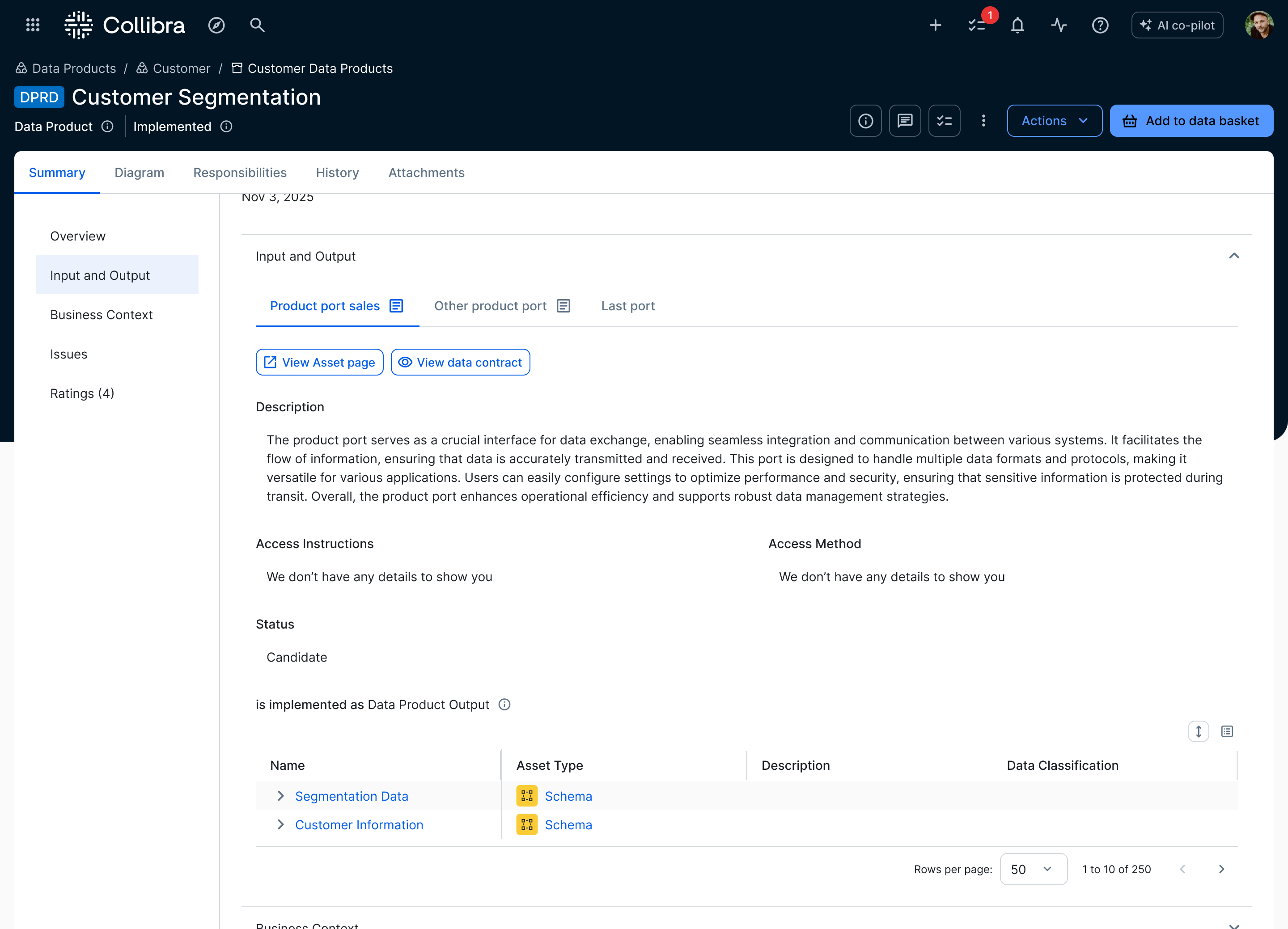
01Before
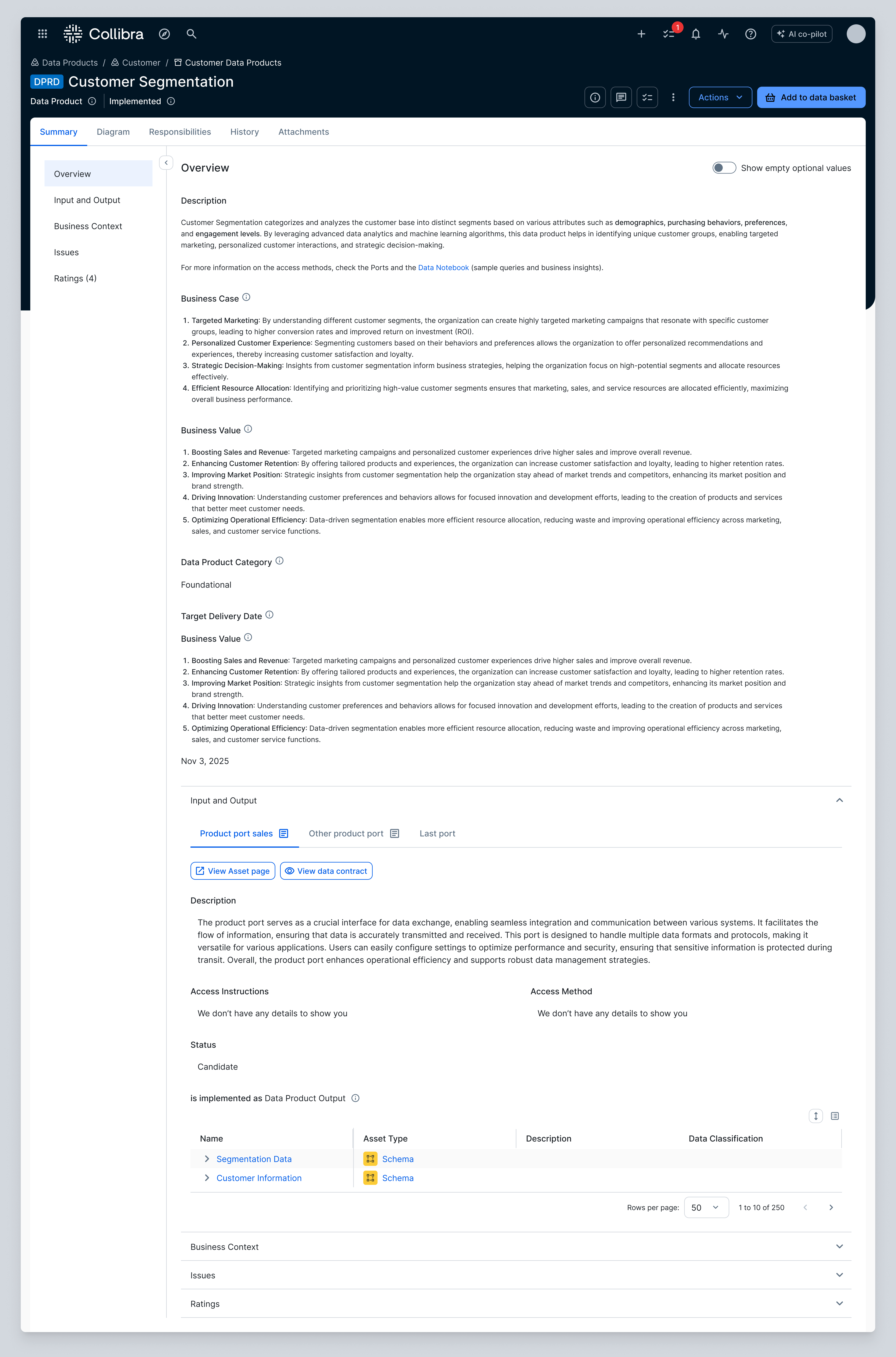
Before: output ports shown as tabs inside a dense data product page 01One port at a timeEach output port occupied a separate tab. 02Two routesData contract stayed here; asset details opened elsewhere.
02Exploration

From the crowded page to a grid and a panel

A cosmetic brief, taken apart: what the old screen made hard, and the shape that replaced it.

Production data-product page before the redesign, with the Output Port Viewer inside a dense page.
01FindOpen a relevant data product
02CompareSee which outputs fit the need
03InspectCheck quality and contract
04ActRequest access with confidence
Current navigation: marketplace leads to a data product page. The data contract opens in a panel on that page. Viewing a port asset page is a detour that requires a manual return. The goal is requesting access. MARKETPLACE CATALOG DATA PRODUCT PAGE VIEWER IN TABS [VIEW DATA CONTRACT] PANEL ON THIS PAGE [VIEW PORT ASSET PAGE] SIDE BRANCH REQUEST (GOAL) HOW IT WORKS NOW MANUAL RETURN VIA BACK OR BREADCRUMBS PORT ASSET PAGE = DETOUR, NOT A STEP
The eight things a port showed, cut in two: the few you weigh to choose a port, and the details you check once you have chosen. Where each one lived on the old page does not line up with that cut. WHERE IT LIVED ONE PORT’S INFORMATION THIS PAGE NAME THIS PAGE STATUS BEHIND A BUTTON DATA CONTRACT THIS PAGE DESCRIPTION ANOTHER PAGE QUALITY SCORE ANOTHER PAGE CATEGORIZATION THIS PAGE ACCESS INSTRUCTIONS ANOTHER PAGE ASSETS TO CHOOSE WHAT YOU WEIGH TO INSPECT AFTER CHOOSING
Two probes. Inside the viewer, the port's fields are grouped and the few you choose by are pulled to the top. On the page, the viewer is given a bounded zone of its own instead of edges shared with the content around it. INSIDE THE VIEWER WHAT YOU CHOOSE BY, PULLED TO THE TOP OUTPUT PORTS STATUS DATA CONTRACT EVERYTHING ELSE, BELOW ON THE PAGE A ZONE OF ITS OWN OUTPUT PORTS THE FIELDS, IN THEIR NEW ORDER
The same widget at two levels, each shown as a block inside the page: a grid where every port is a card carrying the same signals in the same place, and a second level where the card you click opens that port in full. LEVEL 1 ALL THE PORTS, SIDE BY SIDE PORT STATUS CONTRACT DESCRIPTION PORT STATUS CONTRACT DESCRIPTION PORT STATUS CONTRACT DESCRIPTION PORT STATUS CONTRACT DESCRIPTION CLICK A CARD LEVEL 2 ONE PORT IN FULL — GRID STEPS ASIDE NAME STATUS DATA CONTRACT DESCRIPTION QUALITY SCORE CATEGORIZATION ACCESS INSTRUCTIONS ASSETS
One view, split in two: the grid of port cards keeps its place on the left while the port you picked opens in a panel on the right. The data contract is a tab in that panel and the asset page a link inside it. THE GRID THE OTHER CARDS STAY WHERE THEY WERE THE PANEL THE PORT YOU PICKED, IN FULL PORT STATUS CONTRACT DESCRIPTION PORT STATUS CONTRACT DESCRIPTION PORT STATUS CONTRACT DESCRIPTION PORT STATUS CONTRACT DESCRIPTION THE PORT’S DETAILS WHAT YOU CHECK AFTER CHOOSING DATA CONTRACT A TAB IN THIS PANEL ASSET PAGE A LINK OUT TO THE FULL RECORD
Collibra Output Port Viewer — from the crowded page to a grid and a panel
01Context

The Output Port Viewer is a widget on the data product page

Marketplace → data product page → Outputs section → the viewer. It sits low on the page you land on when you open a data product, among everything else.

02Hierarchy

The viewer blended into the page

Attributes, content and the viewer all carried the same visual weight. A consumer would not miss the viewer — but its edges were hard to feel, and the section read as one continuous, slightly chaotic stream.

03Interaction

Tabs showed one port at a time

Each tab exposed one port. To compare several outputs, a consumer had to open them one by one and remember what changed. More ports increased both clicking and recall.

04Navigation

The route to a port, and what leads off it

You arrive from the marketplace, open a data product and land on its page, where the viewer sits in the Outputs section with one tab per port. From a port, two things lead somewhere else: the data contract opens as a panel on the same page, and the port's asset page is a page of its own — you get there by button and come back by hand. At the end of the route is the thing you came for: access.

05Research

Choosing a port is not inspecting it

Mapping the interviews in Dovetail, I looked at what consumers weigh, what they skip and where they slow down. Two kinds of information came apart: the few things you need to choose a port, and the asset details you check once you have chosen. On the page they sat mixed together — and the details lived on a different page, behind a button.

06Probes

Order inside, a boundary around

This is what the brief actually asked for: tidy the widget up, give it room, give it an edge. So the first pass was UI work — I regrouped the port's fields and gave the viewer a zone of its own instead of edges shared with everything around it. What the research decided was the order inside: it told me the few things people weigh when they choose a port, so those went to the top and the rest below. The viewer read better. It still showed one port at a time.

07Cards

A second level inside the viewer

Then I tried a different shape. Every port became a card, all of them side by side, each carrying the same signals in the same place. Clicking a card switched the viewer to that port's details, with a way back to the grid — a drill-down: the depth arrives when you ask for it, and the grid steps aside to make room.

08Panel

Details beside the grid, not instead of it

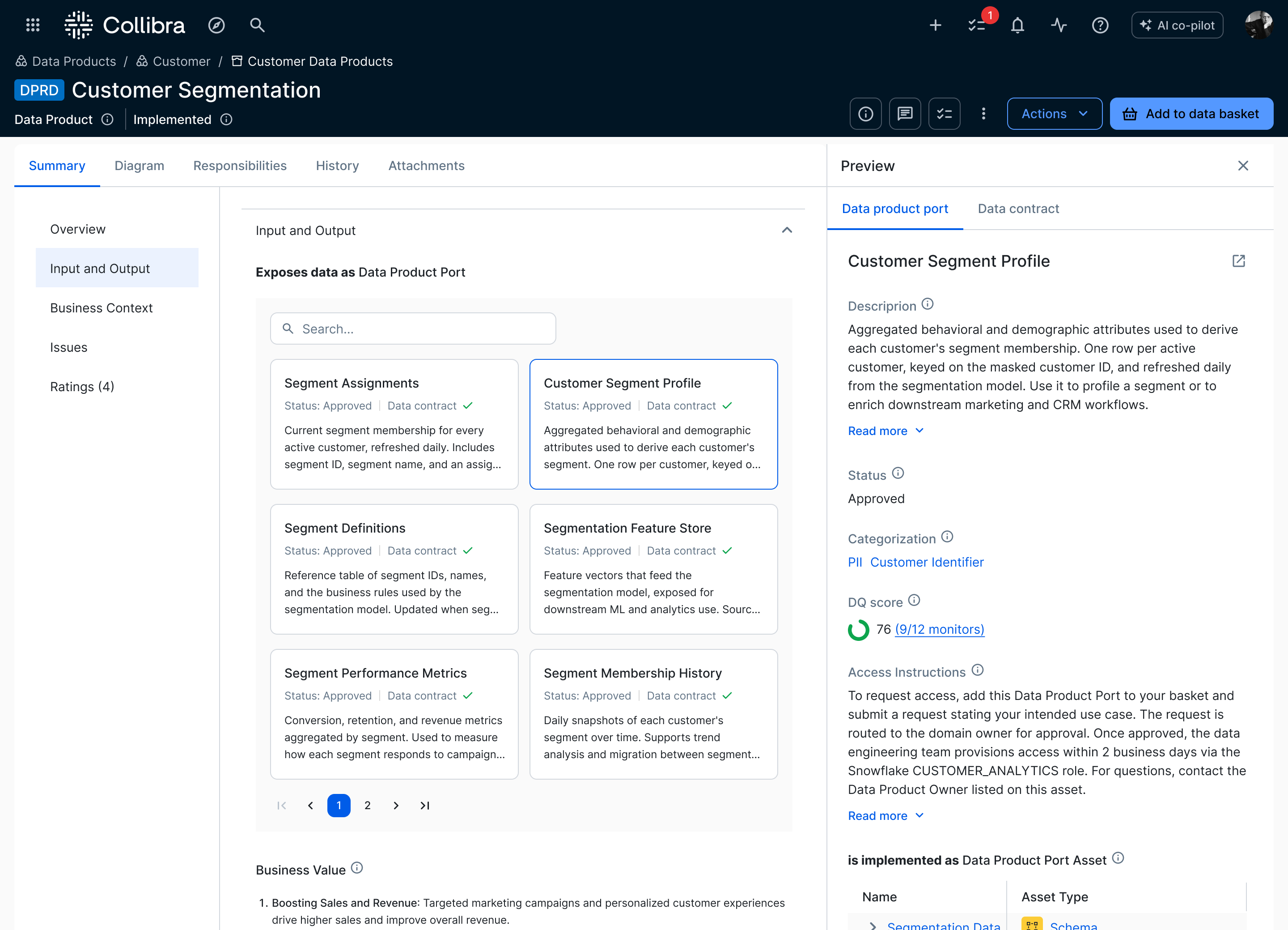
Then the details came out of the widget's second level and into a panel beside the grid: the port you picked opens on the right, the other cards stay where they were — overview and detail side by side instead of one replacing the other. The data contract became a tab in that panel and the asset page a link inside it, so both buttons that used to take you off the page were gone. That was the version I liked, and the one I took forward.

03Solution

Breadth, then depth

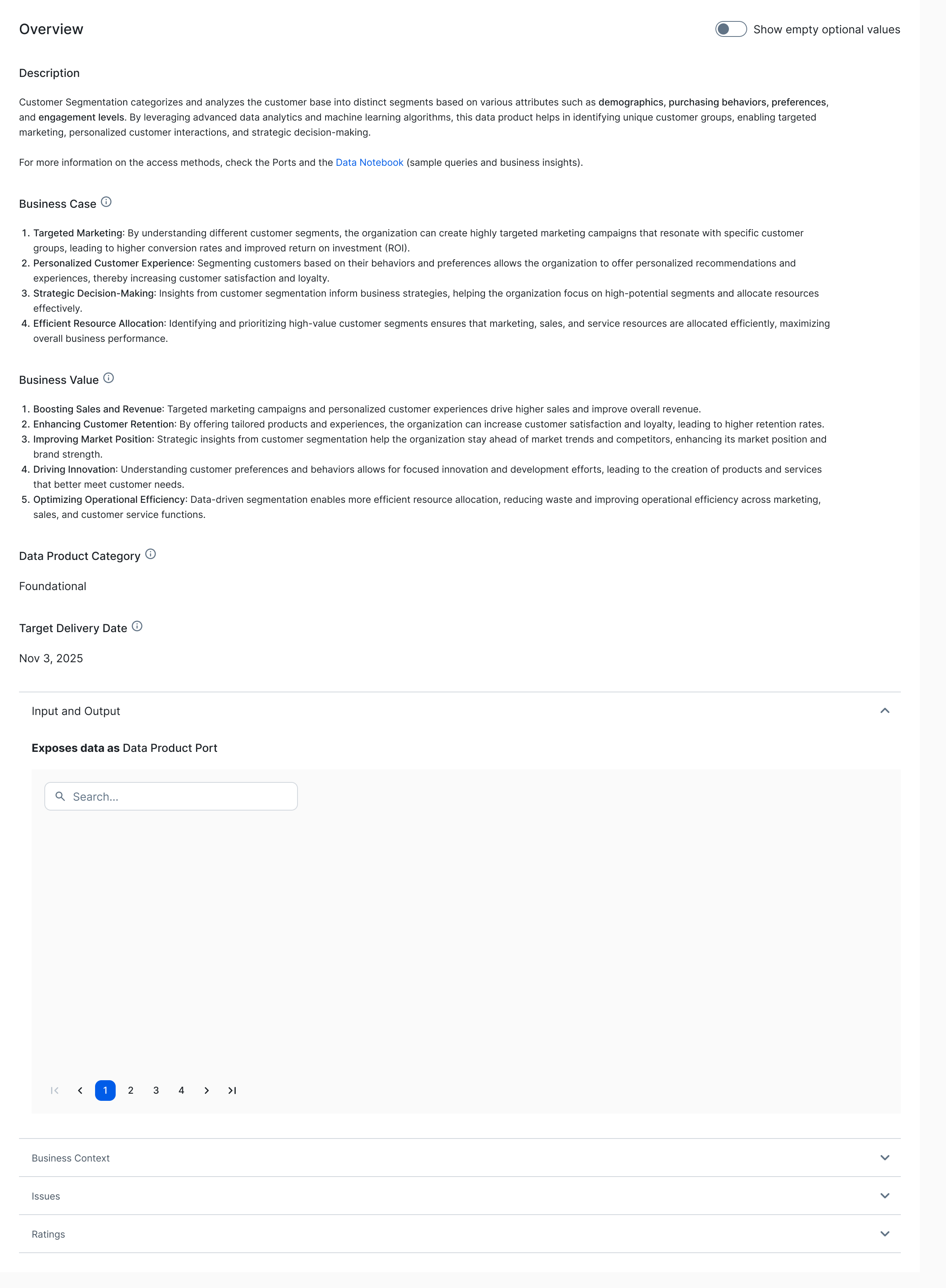
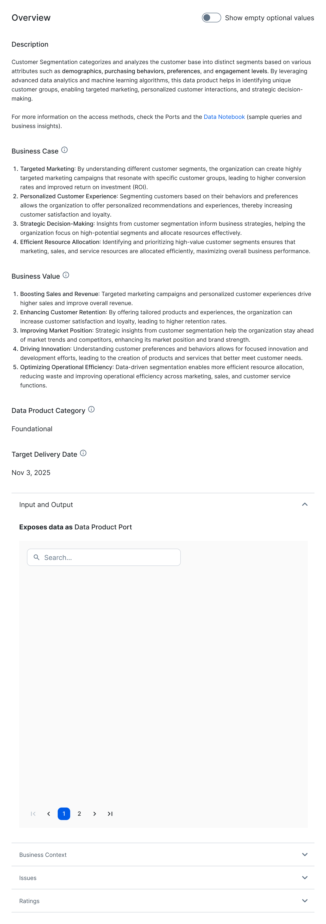
The shipped design is the two-layer split, built in: every port is a card with the same few signals, and the selected port opens in a panel beside the others — not instead of them. Here is the shipped page, walked through the way a consumer meets it.

Collibra Data Product page — the output-ports redesign in context
01Context

The whole product on one page

A data product in Collibra opens on its overview — description, business case, category. The output ports the consumer actually needs to compare live further down the page, past all of this.

02Field

A field, not a stack of tabs

Scroll to the outputs and every port is a card carrying the same signals in the same place: status, data contract, a one-line summary. The eye compares them at a glance instead of clicking tabs one at a time.

03Pick

Pick one to inspect

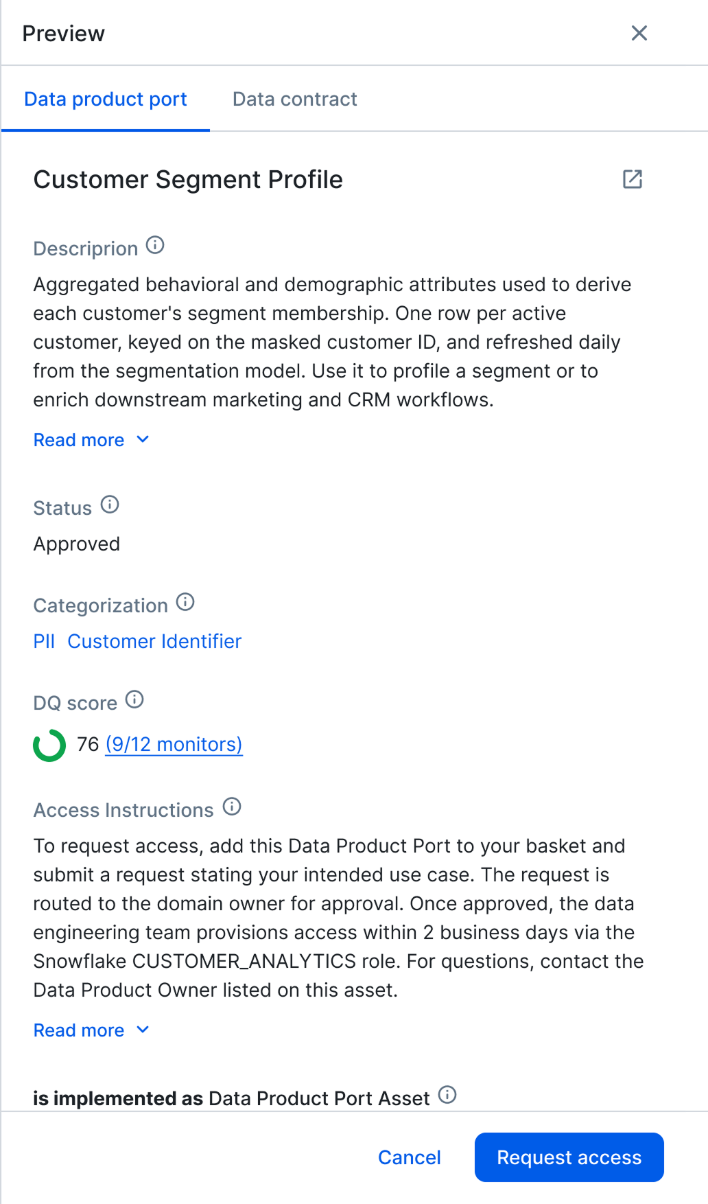
Clicking a card marks it with a Collibra-blue border and opens its detail, without taking the other ports off screen.

04Depth

Depth without losing the field

The preview panel opens beside the grid. The field narrows from three columns to two but does not jump — the cards you were comparing stay where they were, and the contract, quality score and request-access all sit on the one surface.

04Outcome

The brief was cosmetic. The change wasn't.

I was asked to tidy a widget. The interviews pointed elsewhere: nothing was missing and nothing was really cluttered — the detail just sat in front of a decision it didn't help. So I changed what the widget is for, not how it looks.

That's the call I'd make again — and the measure I followed after release is time-to-access: how long a consumer takes from finding a data product to requesting access. The viewer shipped inside a larger Data Product Area redesign, so I won't credit the movement to this widget alone; the numbers stay inside Collibra.

Out of scope, on purpose

This release was the first iteration of the new viewer, shipped deliberately small — and after it we watched closely how consumers used it.

Two threads continued past it. One was the admin side: I started designing how an organisation configures the viewer itself — which attributes its port cards carry, and which stay in the panel. The other was the widget’s soft edge. Admins assemble these pages from arbitrary blocks, so a clear boundary is a platform pattern, not a widget fix; I wrote it up as a proposal for the design-system team.